NASA’s Sunsketcher App User Research
User Research
SunSketcher is a NASA supported mobile app designed for people located in the path of totality during a solar eclipse. Users point their phone at the sun during the eclipse and the app captures timed images that are sent to NASA scientists to help them better understand the shape of the sun. As part of a two person research team, I conducted user research to prepare designers for the scope of the project and identify key considerations for creating an accessible and intuitive interface.
I served as a user researcher for the project alongside another researcher. Together, we conducted secondary research, gathered insight on user demographics, and created a slide deck that summarized our findings for the full design and development team. Our goal was to make sure the designers understood who would be using the app and what barriers might prevent people from participating.
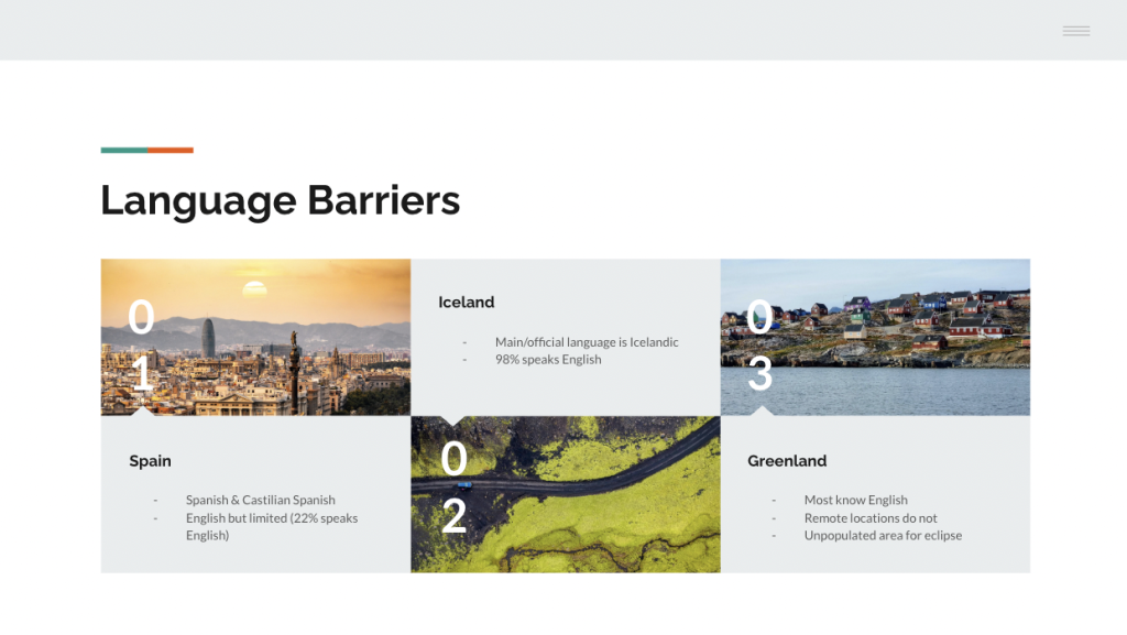
The next eclipse path of totality would pass through several regions with low English literacy, limited access to scientific information, and very inconsistent familiarity with technical instructions. The challenge was to understand how to design an app that allowed users in these areas to participate quickly, safely, and correctly with minimal confusion. The experience needed to work for users with varying language skills, comfort levels, and technological backgrounds.
Secondary Research
Identified geographic, cultural, and linguistic factors in the eclipse path and reviewed previous participation patterns and barriers
User Insight Development
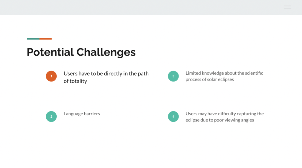
Mapped out what users would need to understand in a very short amount of time and identified points where language could become a barrier
Design Recommendations
Developed actionable guidance for designers, including heavy use of universally recognizable icons, simple shapes, minimal text, and short phrases instead of long instructions
Presentation
Created a slide deck that summarized findings, insights, and design requirements. Presented this to the design team to support their early decision making
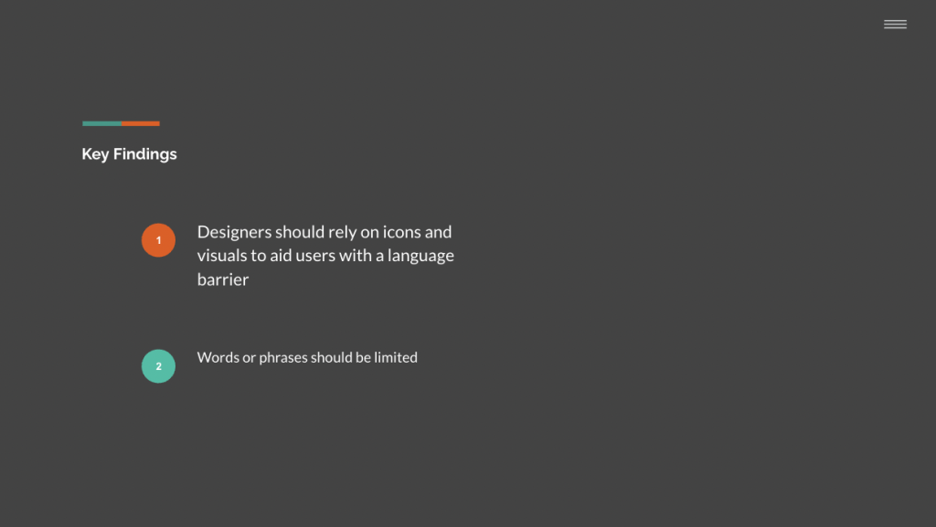
The most important insight was that many users located in the upcoming eclipse path would have limited English proficiency. To ensure accessibility, the app should rely on highly visual communication, simple symbols, recognizable shapes, and minimal reliance on full sentence instructions.
The research helped the design team understand critical accessibility issues before moving into wireframing and UI development. By prioritizing simple, image driven communication, the project moved forward with a clear direction that matched the needs and abilities of the actual user environment.